Sole Lucky
Client: Funk Products
Timeline: Jan–Mar 2023
Platform: iOS
Role: UX Research, Product Design, Brand & UI System
Tools: Figma, Adobe CC, Google Products
Introduction
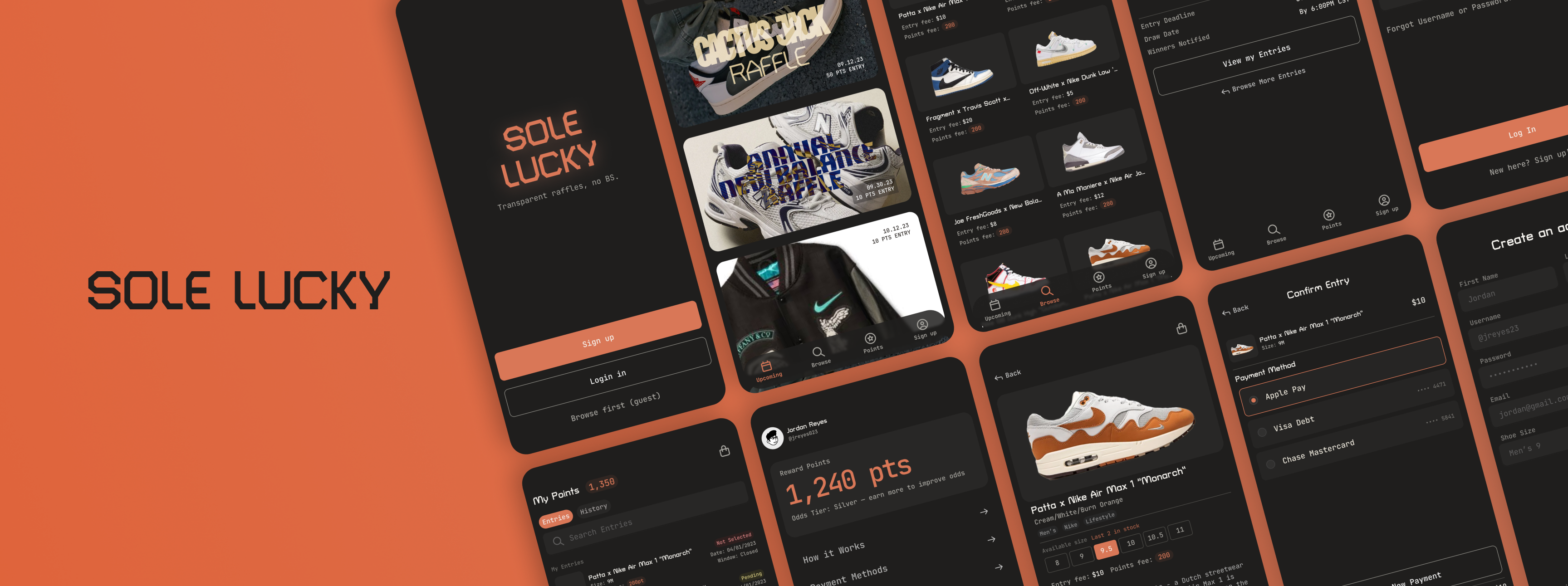
Sole Lucky reimagines how people get access to limited sneaker releases. Instead of competing against bots and resellers on the secondary market, users enter raffles for a chance to buy at retail price, and a points system rewards repeat participation with better odds over time.
The Goal
Design an app where users feel like they're getting a fair shot at exclusive releases, not just another chance to lose to automated buying.
The Challenge
Sneaker raffles have a trust problem. Most platforms don't explain how winners are chosen, bots dominate high-demand drops, and resale prices push casual fans out of the market entirely. The design challenge was building a raffle experience transparent enough that users could trust the odds, wrapped in a UI clean enough to compete with retail-grade apps.
The Process
David started with a quantitative survey to understand where existing raffle and resale apps were failing users, then moved into a competitive audit of the sneaker resale market. From there he built the brand, sketched early concepts, and worked through wireframes, prototypes, and a round of usability testing before refining the final UI.
The Research
Competitive Audit & Survey
After evaluating StockX, GOAT, eBay, and Foot Locker, David pulled the strengths and weaknesses of each into the research and used them to Sole Lucky's advantage. David also ran a quantitative survey with 20 participants to understand pain points with existing sneaker raffle and resale apps, covering screener questions, pain points, and open feedback.
- Price: Resale markup was the single biggest frustration. Users felt priced out of releases they should have had a fair shot at.
- Bots: Automated entries were seen as rigging raffles against real buyers, eroding trust in the fairness of the process.
- Poor UX: No Face ID, no saved payment info, and apps signing users out mid-raffle were recurring complaints across the platforms tested.
User Personas
Ryan McClure
Sneaker Enthusiast · Age 23 · Oklahoma City, OK
“I don't need the hookup, I just want a fair shot at retail price.”
Goals
- Access releases without resale markup
- Trust the raffle is actually fair
- Fast low-friction entry flow
Frustrations
- Bots dominating high-demand drops
- Resale prices
- Apps logging out mid-raffle
Carlos
Family Shopper · Age 42 · Bixby, OK
“I want to see what I need, get it, and get out.”
Goals
- Multiple payment options
- More categories (women's, kids')
- Instant release alerts
Frustrations
- Slow laggy apps
- Feeling bots rigged the outcome
Design Validation
Sketches → Wireframes → Low-Fidelity Prototype
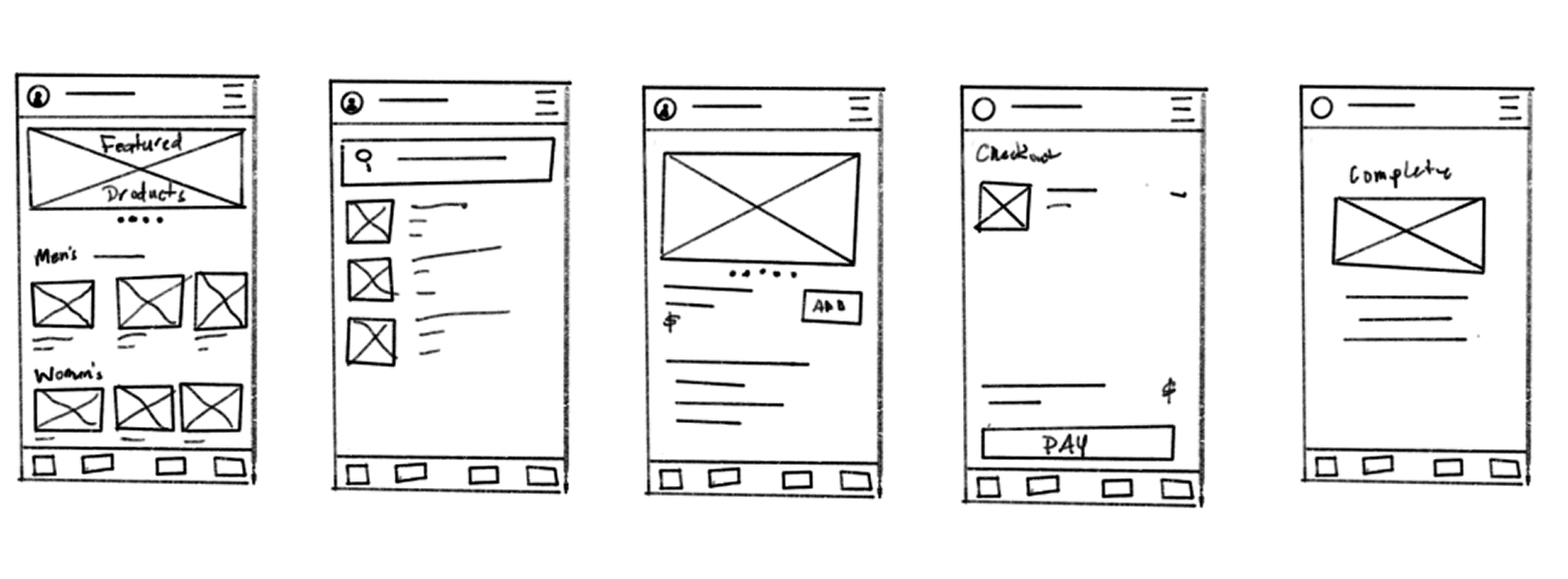
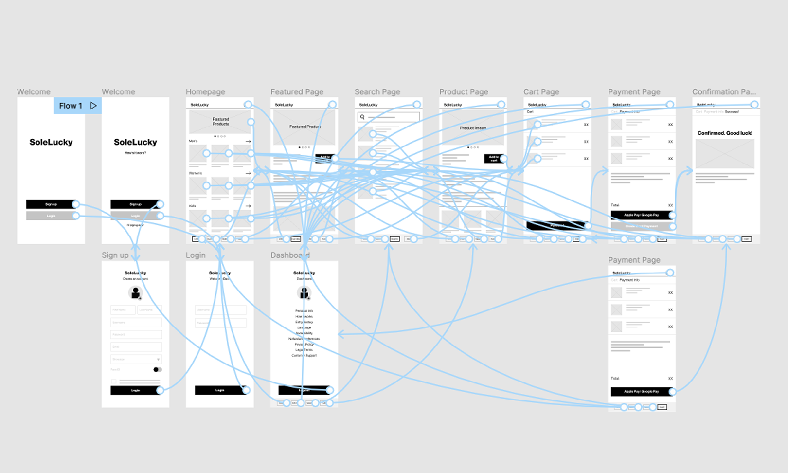
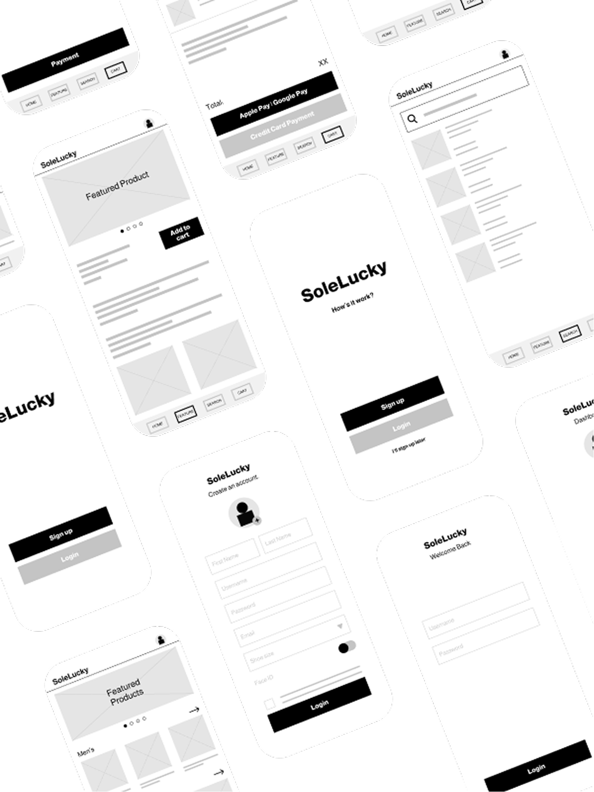
Early sketches kept the design anchored to what stakeholders cared about most: a fast, low-friction entry flow. Wireframes translated that into screen-level decisions, and the low-fidelity prototype focused on making the raffle entry and points system feel effortless before testing it with real users.
Usability Study
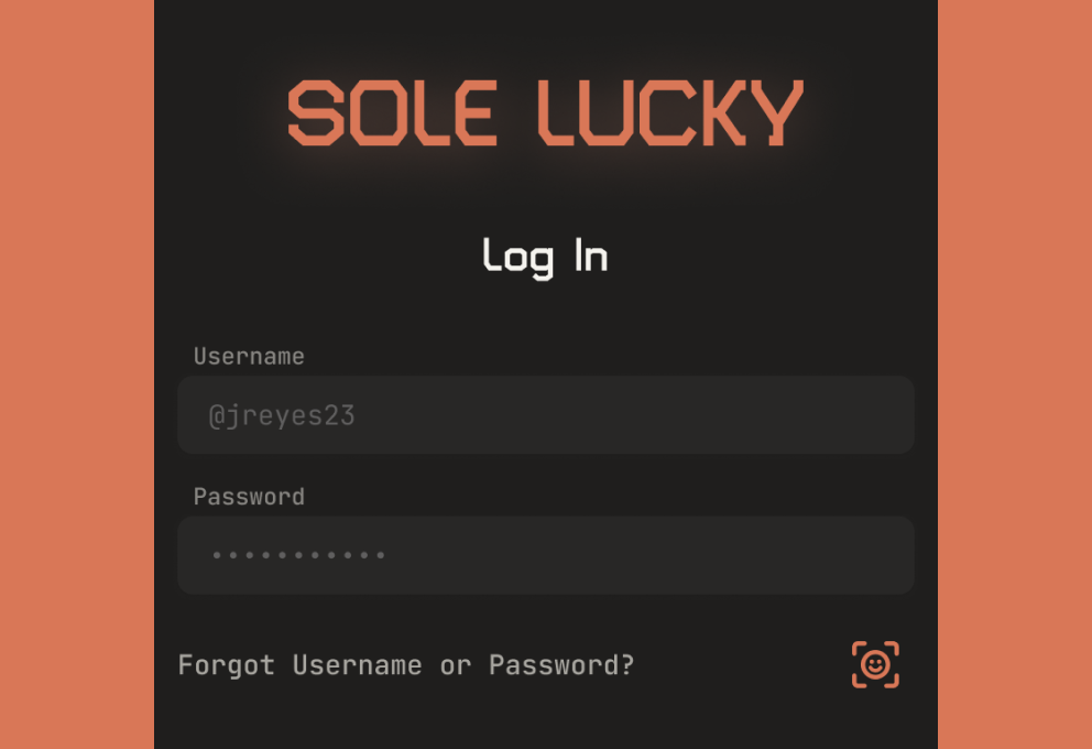
- Users wanted Face ID for login and purchases.
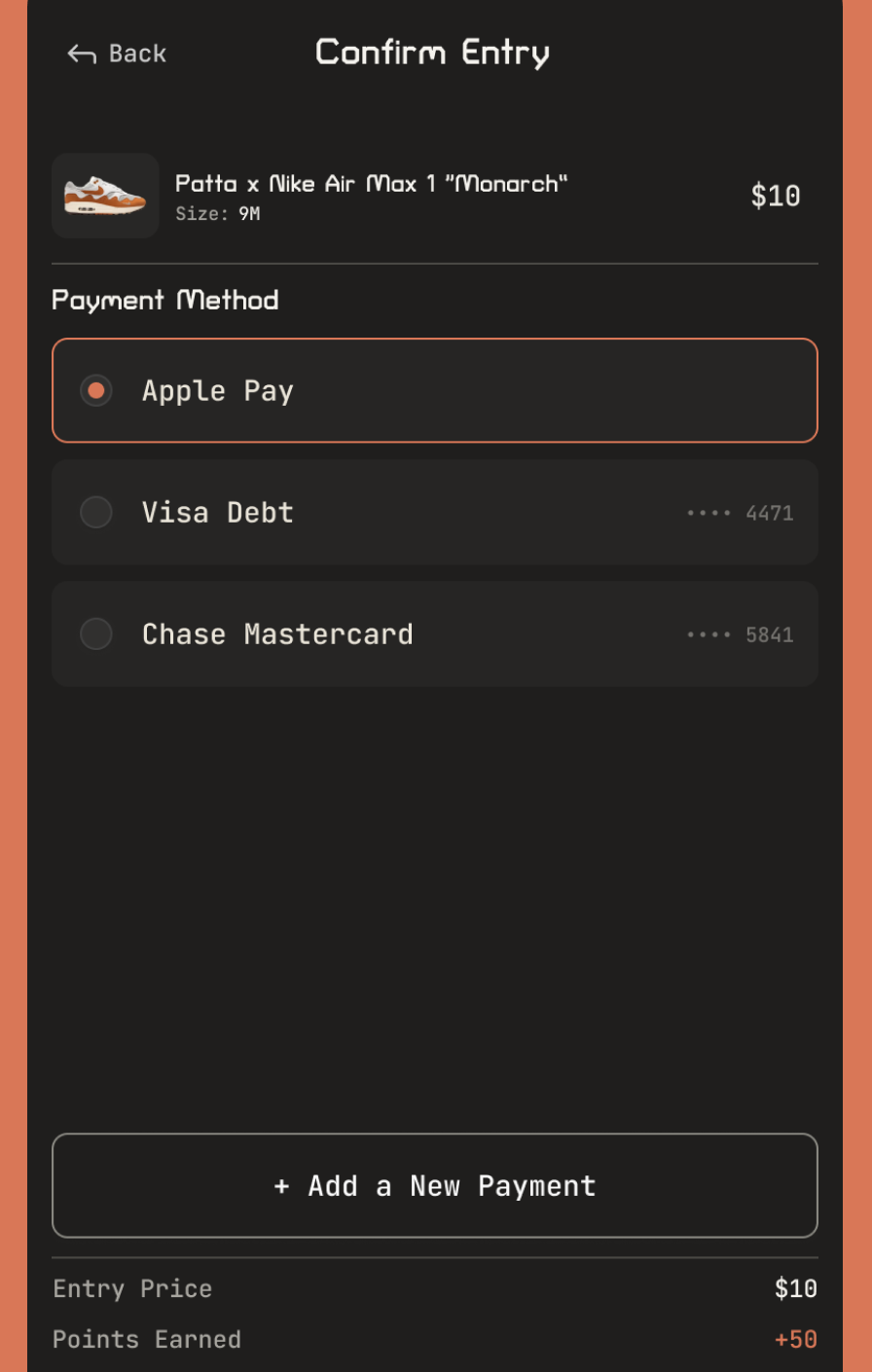
- Apple/Google Pay alone wasn't enough; users expected multiple card options.
- Users wanted to browse before being forced into signup.
- The homepage needed to surface more than men's releases, including women's and kids'.
Brand & UI System
Typography
Turret Road: Display and headline use only (logo, section titles, hero moments). A condensed sans with a technical, slightly industrial character; works well at large sizes but gets harder to read in long-form text, so it stays out of body copy entirely.
JetBrains Mono: UI body, labels, and all functional/data text. Sole Lucky is full of numeric, functional data: prices, sizes, points, entry counts, deadlines. A mono face makes that information feel deliberate and legible rather than decorative, and reinforces an agile product feel over lifestyle-brand polish.
Type Scale
| Style | Font | Size | Weight | Leading | Usage |
|---|---|---|---|---|---|
| Display | Turret Road | 32px | 700 Bold | 38px | Logo, hero moments |
| Heading 1 | Turret Road | 24px | 700 Bold | 29px | Section titles |
| Body Large | JetBrains Mono | 18px | 400 Regular | 27px | Intro copy |
| Body | JetBrains Mono | 16px | 400 Regular | 24px | UI body text |
| Label | JetBrains Mono | 14px | 400 Regular | 20px | Metadata, tags |
| Caption | JetBrains Mono | 12px | 400 Regular | 18px | Timestamps, footnotes |
Color Palette
| Token | Hex / Value | Usage |
|---|---|---|
| Brand Black | #0A0A0A | Page background |
| Off-white | #F5F4F0 | Primary text |
| Lucky Orange | #FF6B2B | CTAs, primary accent |
| Point Gold | #F5B300 | Points, rewards, badges |
| Success | #22C55E | Win/confirm states |
| Error | #EF4444 | Error states, destructive |
| Surface | #1A1A1A | Card backgrounds |
| Border | rgba(255,255,255,0.12) | Dividers, outlines |
Functional States
| Component | Default | Hover | Pressed | Disabled | Focus |
|---|---|---|---|---|---|
| Primary Button | Orange fill, white label | Lighten 10% | Scale 0.97 | 30% opacity, no events | 2px ring, 2px offset |
| Secondary Button | Outline stroke | BG fill 8% | Scale 0.97 | 30% opacity | Ring primary |
| Input | Border 12% opacity | Border 24% opacity | N/A | Muted background | Ring primary color |
| Raffle Card | Surface background | Surface + 8% lift | N/A | 50% opacity | Ring offset 2px |
| Tab / Nav Item | No underline | Underline subtle | Bold weight | N/A | Outline 2px |
Hi-Fidelity
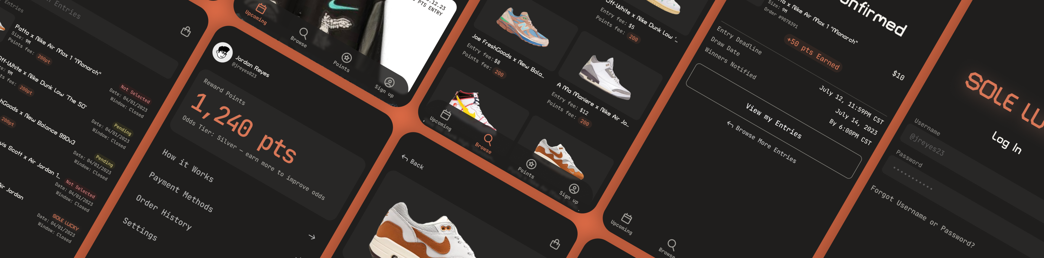
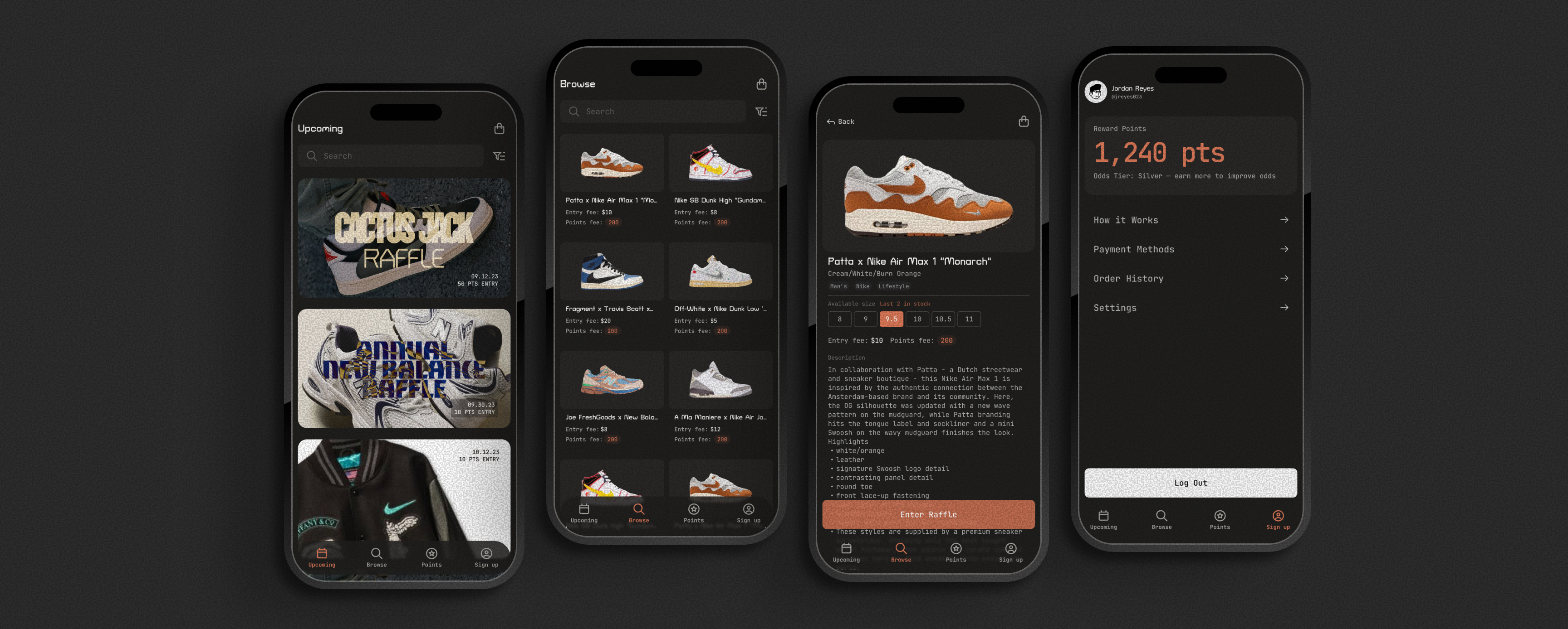
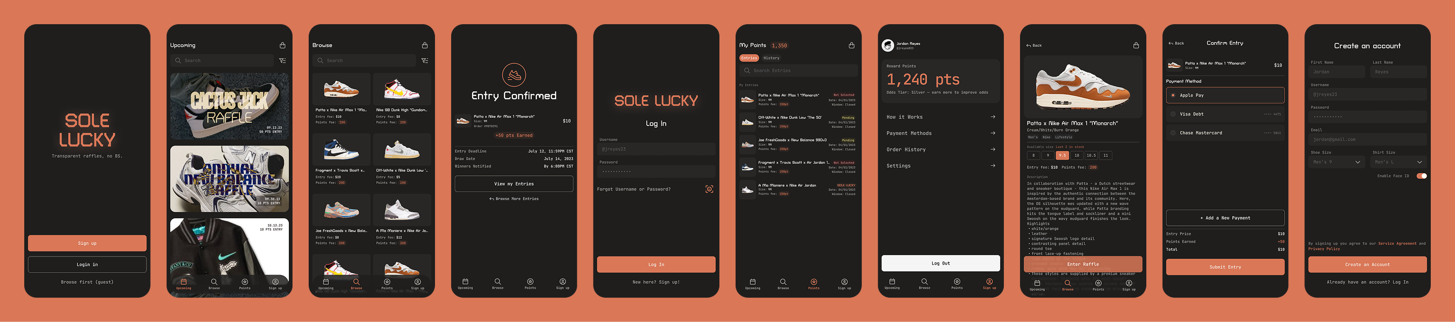
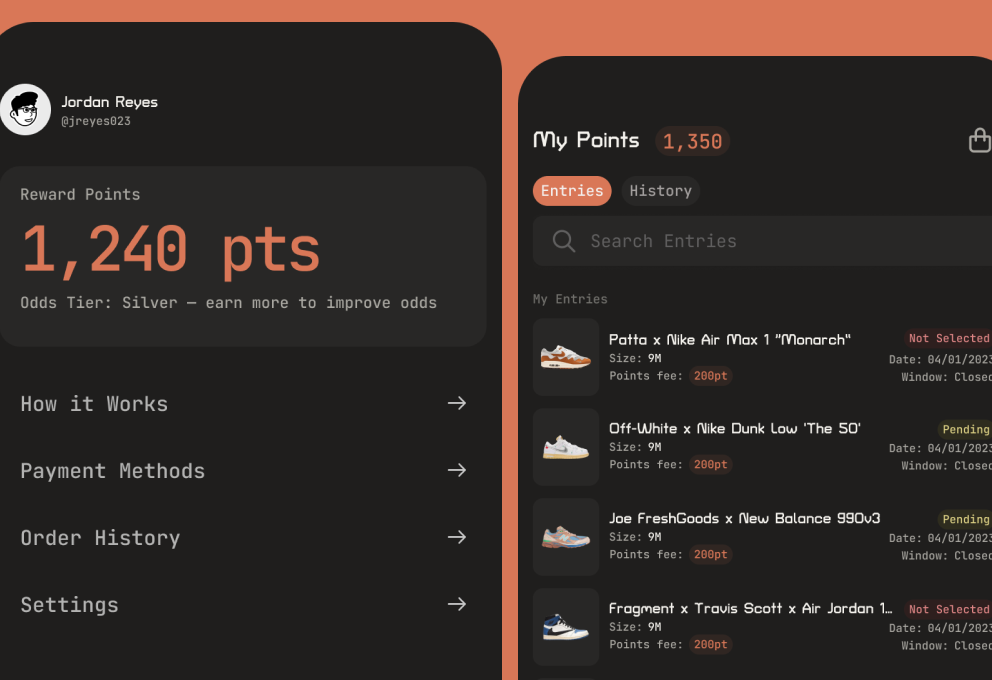
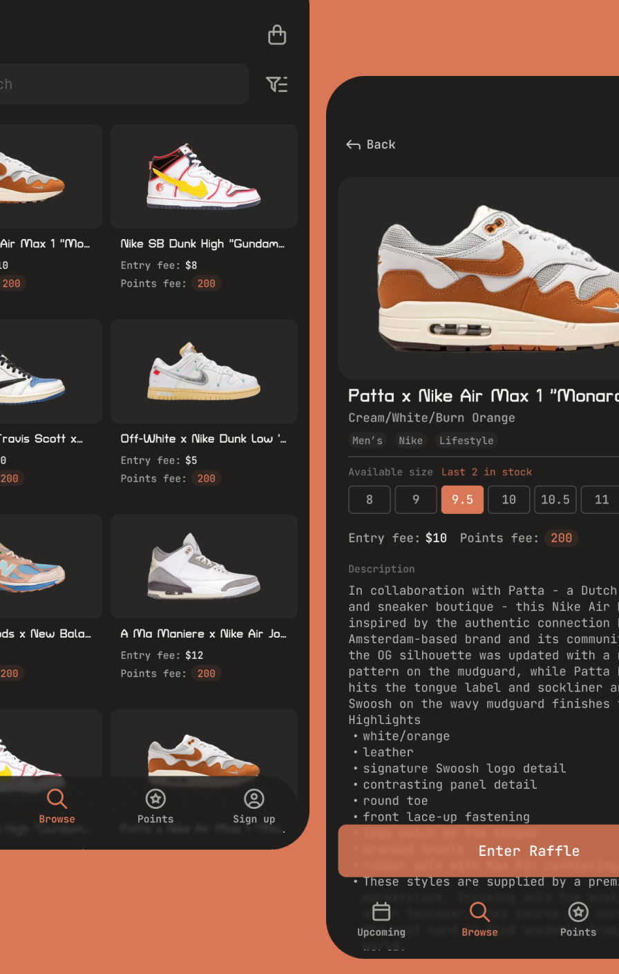
The final designs added expanded homepage categories (men's, women's, kids') and built in the points-based reward system that gives users better raffle odds the more they participate.
Going Forward
Impact
Sole Lucky gives users like Ryan a fair, bot-resistant shot at retail-priced releases instead of competing against automated buying, and gives users like Carlos a faster, family-friendly shopping experience with the payment flexibility and category range he needed. The points system rewards continued participation with better odds over time, rather than treating every entry as an equal coin flip regardless of history.
What David Learned
Designing for a points-based access system meant every product decision had to account for perceived fairness, not just usability. Ryan and Carlos needed different things from the app, but both needed to trust that the raffle mechanic itself wasn't rigged. That's a harder design problem than clean UI alone solves.
Next Steps
- Build a responsive companion site for desktop users.
- Run a usability round focused specifically on whether the points system feels fair and transparent to users.
- Revisit the competitive audit periodically, since resale and raffle apps change their fee and access models often.
Want to know more David Rivas? You can also see or check out .