ramble AI
Client: Personal Project
Timeline: July 2026
Platform: Web
Role: UX Strategy, Product Design
Tools: Figma, Figma MCP, Claude Code, Next.js, Tailwind, Vercel
Introduction
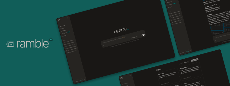
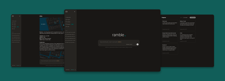
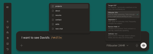
ramble is a portfolio site disguised as an AI chat interface. Instead of a homepage, a project grid, and a scroll, it opens like a real chatbot: a side nav of past conversations, a chat input, and slash commands that pull up real work. The case studies aren't listed as tiles; they're framed as prior chat history, the same way Claude or ChatGPT would surface a thread you'd already started.
The Goal
Prove, through the artifact itself, that this is a designer who understands AI products at the interaction level, not just someone who has opinions about AI from the outside. The portfolio needed to double as evidence.
The Challenge
Most product design portfolios look like product design portfolios. Grid of thumbnails, case study, case study, contact form. That format doesn't say anything about whether the person who built it understands how AI interfaces actually behave: how a slash command resolves, how a model picker works, what a chat history sidebar is doing structurally.
The challenge was building something that reads as fun on first glance and holds up as a serious systems exercise on closer inspection. Every nav item, every joke, every model name needed a reason to exist beyond decoration.
The Research
ramble didn't start from a formal audit with a research phase handed off to a build phase. The research and the build happened at the same time: spending real time inside Claude, ChatGPT, and Perplexity as a working designer, not a passive user, then immediately testing what was learned by building it. A sidebar pattern got noticed, then prototyped. A slash command behavior got tried out, then reworked once it didn't feel right in practice.
That approach fits the project. A portfolio piece meant to demonstrate fluency with AI interaction patterns is more credible when it's built the way an AI-fluent designer actually works: fast, iterative, judgment-driven, without waiting for a research deliverable to greenlight the next design decision.
The dark mode is a deliberate exaggeration of a pattern seen across real AI products, where a neutral dark surface gets a faint color cast instead of staying true gray, as if to say the surface is too considered to just be gray. ramble leans into that on purpose.
The Concept
The name itself is the first joke: an AI portfolio called ramble, a wink at model drift and models that talk in circles instead of landing on an answer, positioned as a study in editing something down to what actually matters, rather than a portfolio that rambles.
The chat interface has two real modes. Serious mode is the case studies, each rendered in full inside a chat response with slash commands like /projects, /about, and /testimonials pulling up structured content. Humor mode is six additional entries built from real technical jargon, written so a technically literate reader gets the joke without the concept needing decoding.
Structuring the Fake Response
Once the chat framing was set, the next problem was making it actually feel like a model generating an answer, not a page that happens to look like a chat. That split into two separate systems. Casual questions, the humor-mode jokes, the /about, the /contact, are handled by a pattern matcher: a list of regexes checked in order against the input, each mapped to a pre-written response, with a catch-all fallback if nothing matches. Case studies are a different problem entirely, because a case study isn't one block of text: it's headings, tables, images, lists, quotes, so those are modeled as an ordered array of typed "sections," each one a small object describing what kind of block it is and what content it holds.
The illusion of generation comes from how those sections get revealed, not from anything actually being computed live. A "thinking..." state runs first, then each block streams in: paragraphs reveal word by word behind a blinking cursor, while lists and tables fade in as whole units, and critically, each block only starts once the previous one signals it's done, chained through an onComplete callback. That chaining is what makes a whole case study read as one continuous response instead of a static page that loaded all at once.
The short version: nothing is actually being generated. Typing something just triggers a lookup, a matching canned reply or a case study's list of content blocks, and every bit of the "AI" feeling comes from how that already-written content gets revealed on screen.
The flow, simplified
The word-stream hook driving every paragraph
function useWordStream(
  text: string,
  active: boolean,
  msPerWord: number,
  onComplete?: () => void,
) {
  const words = useMemo(() => text.split(" "), [text]);
  const [count, setCount] = useState(0);

  useEffect(() => {
    if (!active) return;
    if (count >= words.length) {
      const id = setTimeout(() => onComplete?.(), 80);
      return () => clearTimeout(id);
    }
    const id = setTimeout(() => setCount((c) => c + 1), msPerWord);
    return () => clearTimeout(id);
  }, [active, count, words.length, msPerWord]);

  return { streamed: words.slice(0, count).join(" "), done: count >= words.length };
}
The first pass streamed each case study as a single long string, which looked right for paragraphs but broke immediately on anything structured: a table streaming in word by word just reads as broken, not generated. Splitting content into typed sections, each with its own block component and its own idea of what "appearing" means, is what let the tables, images, and quotes show up all at once while the prose still typed itself out, the same way a real model response mixes prose with rendered components.
Model picker
- Tangent 90°: the flagship. Technically undefined at this point, but confidently so.
- Filibuster 24hr: best for deep reasoning. Talks through every angle before landing on one.
- Digression 7: fast, great for everyday chat. Frequently changes the subject.
- Random Walk ±1: smallest and quickest. Every answer's a coin flip, statistically speaking.
- Verbose -vvv: most creative. The logic doesn't always follow, but the vibes are immaculate.
Brand & UI System


Typography
| Role | Token | Spec |
|---|---|---|
| Heading | --font-sans | Semibold · 24px · −0.5px tracking |
| Body | --font-sans | Regular · 15px / 26px line-height |
| UI label | --font-sans | Medium · 14px / 20px line-height |
| Data / code | --font-mono | Regular · 13px (JetBrains Mono) |
| Icon | --font-awesome | Variable weight · 14px (FA 7 Pro) |
Color
| Role | Semantic token | Primitive | Value |
|---|---|---|---|
| Background | --background | neutral-950 | #10100E |
| Raised surface | --secondary | neutral-800 | #262421 |
| Foreground | --foreground | neutral-50 | #F6F5F4 |
| Muted text | --muted-foreground | neutral-400 | #A29D95 |
| Border | --border | white-alpha-10 | rgba(210,207,203,0.10) |
| Brand teal | --brand-teal-400 | N/A | #2DD4BF |
| Accent orange | --orange-300 | N/A | #FDBA74 |
The warm stone cast (neutral-950 → neutral-50) is intentional, a deliberate contrast to the blue-tinted dark surfaces common in production AI products. All values reference semantic tokens, not hardcoded hex.
Hi-Fidelity Designs
Going Forward
Impact
ramble exists to do something a resume and a static portfolio site can't: put the interaction craft on display while it's being read. A hiring manager scrolling a case study grid takes the designer's word for it. A hiring manager typing /projects into a working chat interface is experiencing the design decision directly.
What David Learned
Building a fake product forced the same discipline as building a real one. Every joke had to earn its place the same way every button has to earn its place in a production UI, and the token architecture had to hold up under a genuinely different brand from the client work it was adapted from, not just get reskinned with new colors.
Next Steps
- Use ramble as the anchor piece in outreach and applications, letting the interaction itself do the work a resume can't.
- Track which parts of ramble actually land in conversation with hiring managers and recruiters, and which get skipped past, then tighten the weak spots.
- Stay positioned as a full-spectrum product designer (UX strategy, product design, brand, and systems), not a systems specialist, since that's the range ramble is built to prove.
Want to know more David Rivas? You can also explore or .